Adaptive Layouts
Adaptive Layouts
Libadwaita provides a number of widgets that change their layout based on the available space. This can be used to make applications adapt their UI between desktop and mobile devices.
Clamp
AdwClamp has one child and constrains its maximum size while still
allowing it to shrink. In other words, it allows the child to have padding when
there’s enough space, and to remove them otherwise.
This is commonly used for patterns such as boxed lists:
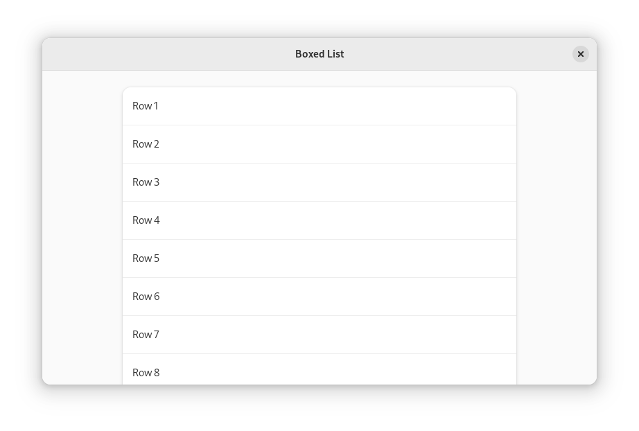
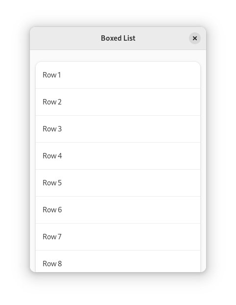
<object class="AdwClamp">
  <property name="child">
    <object class="GtkBox">
      <property name="orientation">vertical</property>
      <property name="margin-top">24</property>
      <property name="margin-bottom">24</property>
      <property name="margin-start">12</property>
      <property name="margin-end">12</property>
      <property name="spacing">24</property>
      <child>
        <object class="GtkListBox">
          <property name="selection-mode">none</property>
          <style>
            <class name="boxed-list"/>
          </style>
          <!-- rows -->
        </object>
      </child>
      <!-- more lists -->
    </object>
  </property>
</object>
See also: AdwClampLayout, AdwClampScrollable.
Leaflet
AdwLeaflet shows all its children side by side when there’s enough room, or
one child otherwise. In other words, it behaves like a GtkBox or
GtkStack.
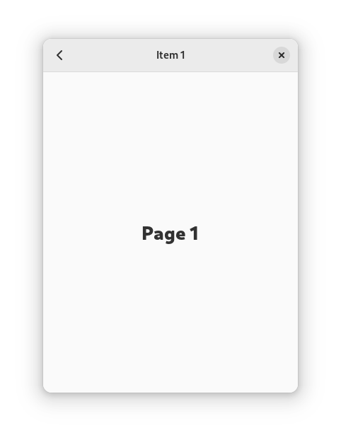
A common use for a leaflet is implementing a split header bar layout, with a sidebar, a content view, and a separator between them:
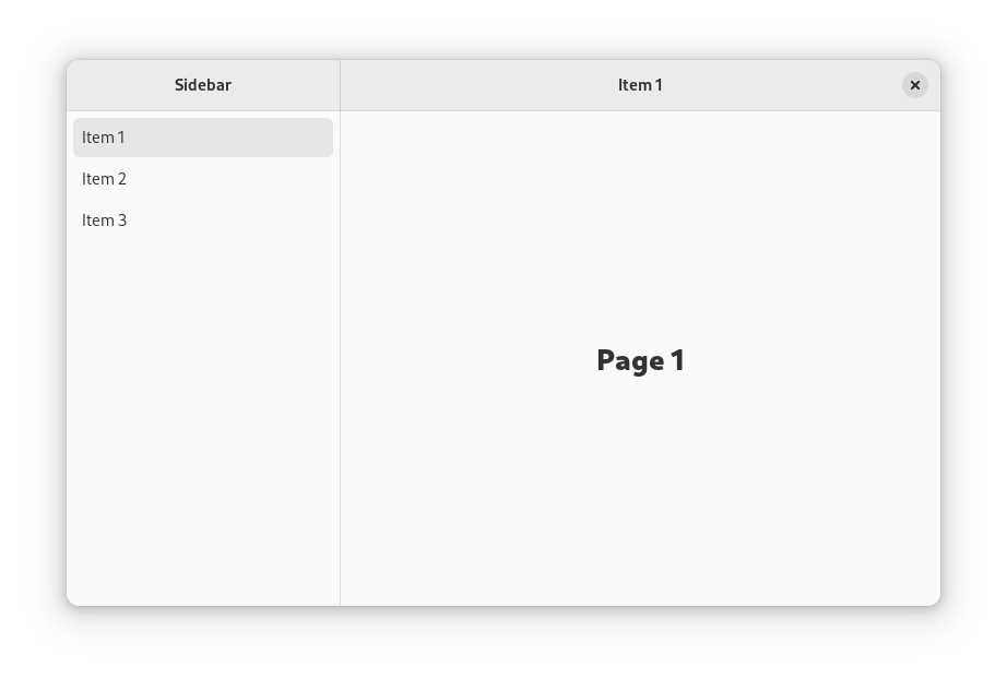
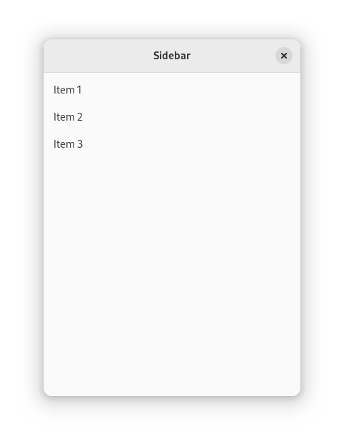
  <object class="AdwLeaflet" id="leaflet">
    <property name="can-navigate-back">True</property>
    <child>
      <object class="GtkBox">
        <property name="orientation">vertical</property>
        <child>
          <object class="AdwHeaderBar">
            <binding name="show-end-title-buttons">
              <lookup name="folded">leaflet</lookup>
            </binding>
            <property name="title-widget">
              <object class="AdwWindowTitle">
                <property name="title" translatable="yes">Sidebar</property>
              </object>
            </property>
          </object>
        </child>
        <!-- sidebar -->
      </object>
    </child>
    <child>
      <object class="AdwLeafletPage">
        <property name="navigatable">False</property>
        <property name="child">
          <object class="GtkSeparator"/>
        </property>
      </object>
    </child>
    <child>
      <object class="GtkBox">
        <property name="orientation">vertical</property>
        <property name="hexpand">True</property>>
        <child>
          <object class="AdwHeaderBar">
            <binding name="show-start-title-buttons">
              <lookup name="folded">leaflet</lookup>
            </binding>
            <child>
              <object class="GtkButton">
                <binding name="visible">
                  <lookup name="folded">leaflet</lookup>
                </binding>
                <property name="icon-name">go-previous-symbolic</property>
              </object>
            </child>
            <property name="title-widget">
              <object class="AdwWindowTitle">
                <property name="title" translatable="yes">Content</property>
              </object>
            </property>
          </object>
        </child>
        <!-- content -->
      </object>
    </child>
  </object>
When the window is wide, the leaflet shows the sidebar, separator, and content
side by side. When it’s narrow, the leaflet shows either sidebar or content,
using the browsing
pattern to navigate between them. If AdwLeaflet:can-navigate-back is set
to TRUE, the leaflet will provide a swipe gesture allowing to go back from
the content page, as well as handle the relevant keyboard shortcuts and mouse buttons.
The application needs to provide a back button and to switch leaflet’s visible
child to content as appropriate (for example, show content after a sidebar row
has been clicked, show sidebar after the back button has been clicked). The
adw_leaflet_navigate() method is convenient for this.
Split header bars are typically used with AdwWindow or
AdwApplicationWindow, since the layout already contains header bars.
Flap
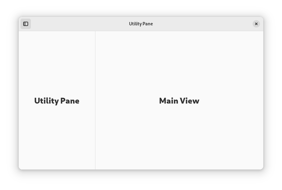
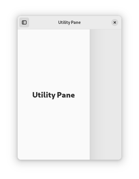
AdwFlap shows children side by side when there’s enough room, or overlays
one child on top of the other otherwise.
This is commonly used to implement utility panes,
via setting the utility pane as the AdwFlap:flap and the main view as
AdwFlap:content.
<object class="GtkToggleButton" id="toggle_pane_button">
  <property name="icon-name">sidebar-show-symbolic</property>
  <property name="active">True</property>
</object>
<!-- ... -->
<object class="AdwFlap">
  <property name="reveal-flap"
            bind-source="toggle_pane_button"
            bind-property="active"
            bind-flags="sync-create|bidirectional"/>
  <property name="flap">
    <!-- utility pane -->
  </property>
  <property name="separator">
    <object class="GtkSeparator"/>
  </property>
  <property name="content">
    <!-- main view -->
  </property>
</object>
To make the utility pane permanently visible on desktop, and only allow to show
and hide it on mobile, bind the relevant properties to
the flap’s AdwFlap:folded value.
<object class="GtkToggleButton" id="toggle_pane_button">
  <property name="icon-name">sidebar-show-symbolic</property>
  <property name="active">True</property>
  <property name="visible"
            bind-source="flap"
            bind-property="folded"
            bind-flags="sync-create"/>
</object>
<!-- ... -->
<object class="AdwFlap" id="flap">
  <property name="reveal-flap"
            bind-source="toggle_pane_button"
            bind-property="active"
            bind-flags="sync-create|bidirectional"/>
  <property name="swipe-to-open"
            bind-source="flap"
            bind-property="folded"
            bind-flags="sync-create"/>
  <property name="swipe-to-close"
            bind-source="flap"
            bind-property="folded"
            bind-flags="sync-create"/>
  <property name="flap">
    <!-- utility pane -->
  </property>
  <property name="separator">
    <object class="GtkSeparator"/>
  </property>
  <property name="content">
    <!-- main view -->
  </property>
</object>
View Switcher
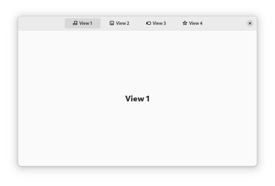
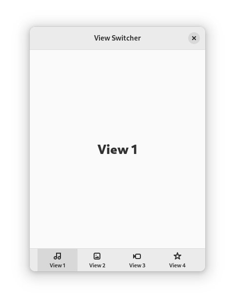
The AdwViewSwitcherTitle and AdwViewSwitcherBar widgets implement an
adaptive view switcher.
They are typically used together, providing desktop and mobile UI for the same navigation: a view switcher in the header bar when there’s enough space, or a view switcher in a bottom bar otherwise.
<object class="GtkBox">
  <property name="orientation">vertical</property>
  <child>
    <object class="AdwHeaderBar">
      <property name="centering-policy">strict</property>
      <property name="title-widget">
        <object class="AdwViewSwitcherTitle" id="title">
          <property name="stack">stack</property>
        </object>
      </property>
    </object>
  </child>
  <child>
    <object class="AdwViewStack" id="stack">
      <property name="vexpand">True</property>
      <!-- pages -->
    </object>
  </child>
  <child>
    <object class="AdwViewSwitcherBar">
      <property name="stack">stack</property>
      <binding name="reveal">
        <lookup name="title-visible">title</lookup>
      </binding>
    </object>
  </child>
</object>
View switcher is also available separately as AdwViewSwitcher. This can be
useful if the higher-level widgets cannot work for some reason.
Squeezer
AdwSqueezer is similar to GtkStack, but shows the largest of its
children that can fit into the available space.
For example, AdwViewSwitcherTitle uses it to conditionally show a view
switcher or the window title.