Boxed Lists
Boxed Lists
Libadwaita provides API to implement the boxed lists pattern.
Boxed lists are composed of a GtkListBox with the
GtkListBox:selection-mode set to GTK_SELECTION_NONE and with the
.boxed-list or .boxed-list-separate
style classes.
GtkListView cannot be used as a boxed list at the moment.
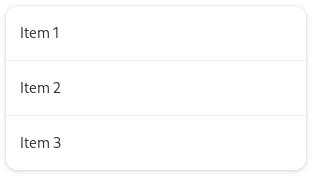
An example boxed list:
<object class="GtkListBox">
  <property name="selection-mode">none</property>
  <style>
    <class name="boxed-list"/>
  </style>
  <child>
    <object class="AdwActionRow">
      <property name="title">Item 1</property>
    </object>
  </child>
  <child>
    <object class="AdwActionRow">
      <property name="title">Item 2</property>
    </object>
  </child>
  <child>
    <object class="AdwActionRow">
      <property name="title">Item 3</property>
    </object>
  </child>
</object>

Rows
A number of predefined list row classes are available and intended to be used inside boxed lists:
Action Rows
AdwActionRow is a basic row. It has a title, a subtitle, an icon, and can
have prefix and suffix children.

Switch Rows
AdwSwitchRow is an AdwActionRow with an embedded GtkSwitch.
It’s used to represent two states: “on” and “off”.

Expander Rows
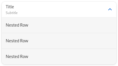
AdwExpanderRow is similar to AdwActionRow, but can expand to show
other rows.

Combo Rows
AdwComboRow is a row with an embedded drop down menu, similar to
GtkDropDown.

Entry Rows
AdwEntryRow is a row with an embedded entry. It can have prefix and suffix
widgets, and an apply button.

Password Entry Rows
AdwPasswordEntryRow is a variant of AdwEntryRow tailored for entering
secrets. It conceals the text and provides a button to show it, along with a
Caps Lock indicator.

Spin Rows
AdwSpinRow is a AdwActionRow with an embedded
GtkSpinButton.

Property Rows
When used together with the .property
style class, AdwActionRow and AdwExpanderRow deemphasize their title
and emphasize their subtitle instead, which is useful for displaying read-only properties:
<object class="AdwActionRow">
  <property name="title" translatable="yes">Property Name</property>
  <property name="subtitle">Value</property>
  <property name="subtitle-selectable">True</property>
  <style>
    <class name="property"/>
  </style>
</object>

Button Rows
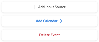
AdwButtonRow is a list row that acts as a button. It can be useful for
presenting actions at the end of a boxed list.

Preferences Group
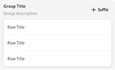
AdwPreferencesGroup provides a boxed list along with a title and a
description. It’s mainly meant to be used as a child of AdwPreferencesPage,
but can also be used separately.
The AdwPreferencesGroup:separate-rows property can be used to separate
rows in its boxed list.
