Style Classes
Style Classes
The Adwaita stylesheet provides a number of style classes. They can be applied to widgets to change their appearance.
Buttons
The following style classes can be applied to GtkButton to change its appearance.
Suggested Action


The .suggested-action style class makes the button use accent colors. It can
be used to denote important buttons, for example, the affirmative button in an
action dialog.
It can be used in combination with .circular or .pill.
Can also be used with GtkMenuButton, AdwSplitButton or
AdwButtonRow.
Destructive Action


The .destructive-action style class makes the button use destructive colors.
It can be used to draw attention to the potentially damaging consequences of
using a button. This style acts as a warning to the user.
It can be used in combination with .flat, .circular,
or .pill.
Can also be used with GtkMenuButton, AdwSplitButton or
AdwButtonRow.
Flat

The .flat style class makes the button use flat appearance, looking like a
label or an icon until hovered.
Button inside toolbars and similar widgets appear flat by default.
It can be used in combination with .circular or .pill.
Can also be used with GtkMenuButton or AdwSplitButton.
Can be set via GtkButton:has-frame and
GtkMenuButton:has-frame.
Raised

The .raised style class makes the button use the regular appearance instead of
the flat one.
This style class is only useful inside toolbars and similar widgets.
It can be used in combination with .circular or .pill.
Can also be used with GtkMenuButton or AdwSplitButton.
Circular

The .circular style class makes the button round. It can be used with buttons
containing icons or short labels (1-2 characters).
It can be used in combination with .suggested-action,
.destructive-action, .flat,
.raised, .opaque or .osd.
Can also be used with GtkMenuButton.
Pill

The .pill style class makes the button appear as a pill. It’s often used for
important standalone buttons, for example, inside a AdwStatusPage.
It can be used in combination with .suggested-action,
.destructive-action, .flat,
.raised, .opaque or .osd.
Toggle Groups
The following style classes can be applied to AdwToggleGroup or
AdwInlineViewSwitcher to change its appearance.
Flat

The .flat style class makes the group look like a series of flat buttons.
It can be used in combination with .round.
Round

The .round style class makes the group, as well as toggles inside it rounded.
It can be used in combination with .flat.
Linked Controls

The .linked style class can be applied to a GtkBox to make its
children appear as a single group. The box must have no spacing.
Linked boxes can be both horizontal and vertical.
The following widgets can be linked:
GtkButtonGtkMenuButtonGtkDropDownGtkColorDialogButtonGtkFontDialogButtonAdwTabButtonGtkEntryGtkPasswordEntryGtkSearchEntryGtkSpinButton
Linked styles will not work correctly for buttons with the following style classes:
If a linked box is contained within a toolbar or a similar widget, buttons inside it won’t get the flat appearance.
Toolbars

The .toolbar style class can be applied to a horizontal GtkBox. The
same appearance is also used by AdwHeaderBar, GtkHeaderBar,
GtkActionBar and GtkSearchBar automatically.
It changes the appearance of buttons inside it to make them flat when possible, according to the following rules:
The following buttons get flat appearance:

- Icon-only buttons;
- Buttons with an icon and a label (using
AdwButtonContent); - Menu buttons containing an arrow;
AdwSplitButton;- Any other button with the
.flatstyle class.
The following buttons keep default appearance:

- Text-only buttons;
- Buttons with other content;
- Buttons within widgets with the
.linkedstyle class; - Buttons with the
.suggested-actionor.opaquestyle classes; - Buttons with the
.destructive-actionstyle class; - Buttons with the
.raisedstyle class.
It also ensures 6px margins and spacing between widgets. The
.spacer style class can be useful to separate groups of widgets.
Important
The GtkButton:has-frame property will not be set to FALSE
when a button gets the flat appearance automatically. It also cannot be set
to TRUE to make a button raised, the style class should be used directly instead.
Spacers

The .spacer style class can be applied to a GtkSeparator to make it
appear invisible and act as whitespace. This can be useful with toolbars and
similar widgets to separate groups of widgets from each other.
Dimmed

The .dimmed style class make the widget it’s applied to partially transparent.
The opacity changes between regular and high contrast styles and is represented
by the --dim-opacity variable. Use that variable
if the style class cannot be used directly.
Since: 1.7
Typography Styles
These style classes can be applied to any widgets, but are mostly used for
GtkLabel or other widgets that contain them.

The .title-1, .title-2, .title-3, .title-4 classes provide four levels
of title styles, indicating hierarchy. The specific use heavily depends on
context. Generally, the larger styles are intended to be used in bigger views
with plenty of whitespace around them.

The .heading style class is the standard style for UI headings using the
default text size, such as window titles or boxed list labels.

The .body style class is the default text style.

The .caption-heading and .caption style classes make text smaller. They
are intended to be used to differentiate sub-text which accompanies text in
the regular body style.

The .monospace style class makes the widget use the
monospace font. This can be useful when
displaying code, logs or shell commands.
For AdwEntryRow, it only makes the editable part monospace, but not title
or any extra widgets. To make everything in the row monospace, apply
.monospace to the GtkListBox around the row.

The .numeric style class makes the widget use tabular figures. This is
equivalent to using PangoAttrFontFeatures with "tnum=1" features.
This style is useful in situations where multiple labels are vertically aligned,
or when displaying time, an operation progress or another number that can
quickly change.
Colors

The following style classes change widget colors:
| Class | Color |
|---|---|
| .accent | accent color |
| .success | success color |
| .warning | warning color |
| .error | error color |
They can be applied to any widget.
The .error, .warning, .success style classes also change the widget’s
accent color to the respective color. They can also be applied to
GtkEntry. In that case, they can be used to indicate input validation state.
Boxed Lists & Cards
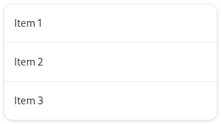
The .boxed-list style class can be applied to a GtkListBox to make it
a boxed list. The list box should have
GtkListBox:selection-mode set to GTK_SELECTION_NONE.
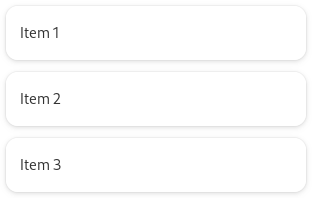
The .boxed-list-separate style class is similar to .boxed-list, but presents
each row as a separate card instead of the whole list being a single card with
separators. The list box should have GtkListBox:selection-mode set
to GTK_SELECTION_NONE.
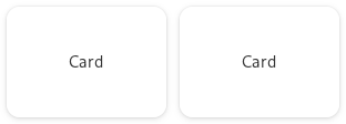
The .card style class can be applied to any other widget to give it a similar appearance.
If a widget with the .card style class also has the .activatable style
class, it will also have hover and active states similar to an activatable row
inside a boxed list.
If the .card style class is applied to a GtkButton, it will get these
states automatically, without needing the .activatable class.
Sidebars

The .navigation-sidebar style class can be applied to a GtkListBox
or GtkListView, as well as GtkFlowBox and
GtkGridView, to make it look like a sidebar: it makes the items rounded
and padded, makes selected items use neutral color instead of accent, and
removes the default list background.
App Icons
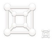
GNOME application icons require a shadow to be legible on a light background.
The .icon-dropshadow and .lowres-icon style classes provide it when used
with GtkImage or any other widget that contains an image.
.lowres-icon should be used for 32×32 or smaller icons, and .icon-dropshadow
should be used otherwise.
Selection Mode Check Buttons

The .selection-mode style class can be added to a GtkCheckButton to
give it a larger and round appearance. These check buttons are intended to be
used for selecting items from a list or a grid.
OSD

The .osd style class has a number of loosely related purposes depending on
what widget it’s applied to.
Usually, it makes the widget background dark and partially transparent, and makes its accent color white.
However, it has different effects in a few specific cases.
Overlay Buttons

When used with GtkButton, .osd can be used to create large standalone
buttons that overlap content, for example, the previous/next page arrows in an
image viewer. They appear dark and slightly larger than regular buttons.
It can be used in combination with .circular or .pill.
Floating Toolbars

When used along with the .toolbar style class, .osd gives the
box additional padding and round corners. This can be used to create floating
toolbars, such as video player controls.
Progress Bars
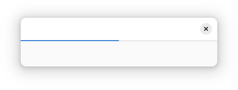
When used with GtkProgressBar, .osd makes the progress bar thinner
and removes its visible trough.
OSD progress bars are intended to be used as GtkOverlay children,
attached to the top of the window.
Background

The .background style class can be used with any widget to give it the default
window background and foreground colors.
This can be useful when a widget needs an opaque background.
It’s equivalent to using the following CSS:
.background {
  background-color: var(--window-bg-color);
  color: var(--window-fg-color);
}
View

The .view style class can be used with any widget to give it the default
view background and foreground colors.
It’s equivalent to using the following CSS:
.view {
  background-color: var(--view-bg-color);
  color: var(--view-fg-color);
}
Frame

The .frame style class can be used with any widget to give it the default border.
It’s equivalent to using the following CSS:
.frame {
  border: 1px solid var(--border-color);
}
Compact Status Page

The .compact style class can be used with a AdwStatusPage to make it take
less space. This is usually used with sidebars or popovers.
Menu Popovers
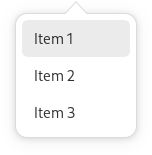
The .menu style class can be used with a GtkPopover to give it a
menu-like appearance if it has a GtkListBox or a GtkListView
inside it.
Development Window
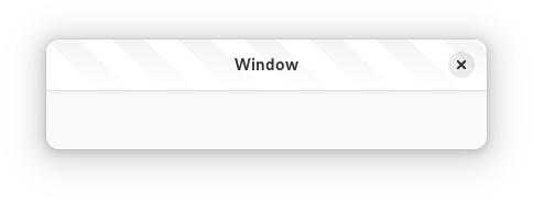
The .devel style class can be used with GtkWindow. This will give
any AdwHeaderBar or GtkHeaderBar inside that window a striped appearance.
This style class is typically used to indicate unstable or nightly applications.
Inline


The .inline style class can be used with GtkSearchBar, AdwTabBar
or GtkTextView.
By default GtkSearchBar and AdwTabBar look like a part of an AdwHeaderBar
and are intended to be used directly attached to one or used as
AdwToolbarView toolbars. With the .inline style class they have neutral
backgrounds and can be used in different contexts instead.
When used with GtkTextView, it allows it to e.g. be put into a card while
following its styles.
Note
The .inline style class cannot be used with GtkSourceView.
Undershoot Indicators
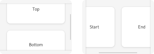
The .undershoot-top, .undershoot-bottom, .undershoot-start and
.undershoot-end style classes can be used with GtkScrolledWindow to
add an undershoot indicator on the given edge, presented as a shadow.
.undershoot-start and .undershoot-end automatically follow text direction,
same as GtkWidget:margin-start and GtkWidget:margin-end.
Most applications should use AdwToolbarView instead, as it manages
undershoots automatically based on presence and visibility of top and bottom bars.
Since: 1.4
Property Rows

The .property style class can be used with AdwActionRow and
AdwExpanderRow. It deemphasizes the row title and emphasizes subtitle
instead, which is useful for displaying read-only properties, as follows:
<object class="AdwActionRow">
  <property name="title" translatable="yes">Property Name</property>
  <property name="subtitle">Value</property>
  <property name="subtitle-selectable">True</property>
  <style>
    <class name="property"/>
  </style>
</object>
Since: 1.4
The .monospace style class with .property only makes the subtitle monospace,
but not the title or any extra widgets. To make everything in the row monospace,
apply .monospace to the GtkListBox around the row.
Since: 1.6
Deprecated Style Classes
The following style classes are deprecated and remain there for compatibility. They shouldn’t be used in new code.
.content

The .content style class can be applied to a GtkListBox to give it a
boxed list appearance. The .boxed-list style class is
completely equivalent to it and should be used instead.
.sidebar

The .sidebar style class adds a border at the end of the widget (border-right
for left-to-right text direction, border-left for right-to-left) and removes
background from any GtkListBox or GtkListView inside it.
It can be replaced by using the .navigation-sidebar style class
on the list widget, combined with a GtkSeparator to achieve the border.
.app-notification

The .app-notification style class is used with widgets like GtkBox.
It adds .osd appearance to the widget and makes its bottom corners
round. When used together with a GtkOverlay and a GtkRevealer,
it allows creating in-app notifications.
AdwToastOverlay can be used to replace it.
.large-title

The .large-title style class makes text large and thin. It’s the largest
style, infrequently used for display headings in greeters or assistants. It
should only be used in conjunction with large amounts of whitespace.
The .title-1 style class should be used instead.
Deprecated since: 1.2
Flat Header Bar

The .flat style class can be used with an AdwHeaderBar or
GtkHeaderBar to give it a flat appearance.
Use AdwToolbarView instead.
Deprecated since: 1.4
.opaque

The .opaque style class gives the button an opaque background. It’s intended
to be used together with custom styles that override background-color and
color, to create buttons with an appearance similar to
.suggested-action, but with custom colors.
For example, .suggested-action is equivalent to using the .opaque style
using the .opaque style
class with the following CSS:
#custom-suggested-action-button {
  background-color: var(--accent-bg-color);
  color: var(--accent-fg-color);
}
It can be used in combination with .circular or .pill.
Can also be used with GtkMenuButton or AdwSplitButton.
Use .suggested-action instead, and override the accent
color, for example:
#custom-destructive-action-button {
  --accent-bg-color: var(--destructive-bg-color);
  --accent-fg-color: var(--destructive-fg-color);
  --accent-color: var(--destructive-color);
}
Deprecated since: 1.6
.dim-label

The .dim-label style class makes the widget it’s applied to partially transparent.
The opacity changes between regular and high contrast styles and is represented
by the --dim-opacity variable. Use that variable
if the style class cannot be used directly.
The .dimmed style class is completely equivalent to it and should
be used instead.
Deprecated since: 1.7